Beyond a Single Shade: Dulux Reveals Three Colours of the Year for 2026
Dulux experts translate global trends and insights into a Colour of the Year annually, to reflect the mood of the moment.
In a bold shift from tradition, Dulux has unveiled not just one Colour of the Year for 2026, but a carefully curated trio of shades designed to work together in harmony. Under the theme "Rhythm of Blues," this year's palette moves beyond a single statement colour and embraces the variety that blue can offer.
2026 will mark the first time more than one colour has been chosen for the Colour of the Year campaign, with the intention of helping us to 'slow down, connect and embrace creativity'.
Colour of the Year
Since 2004, Dulux has been forecasting the Colour of the Year - a shade chosen through extensive research into global design, fashion, social and cultural trends. The selection process is held at AkzoNobel's Global Aesthetics Centre in Amsterdam, where colour experts, designers and forecasters come together to identify the tones that reflect the mood of the times and anticipate how people want their homes to feel.
Each year's choice is intended not just as a decorative trend, but as a reflection of broader social and emotional shifts. Within the first 10 years, the team talked about colours in general and small day-to-day trends. Now a specific colour, that the experts truly believe is best for four walls, is nominated. For example:
2017: Denim Drift - a versatile blue chosen during a period of social change, symbolising stability and adaptability.
2020: Tranquil Dawn - a soft greenish hue, representing fresh starts and a desire for calm in uncertain times.
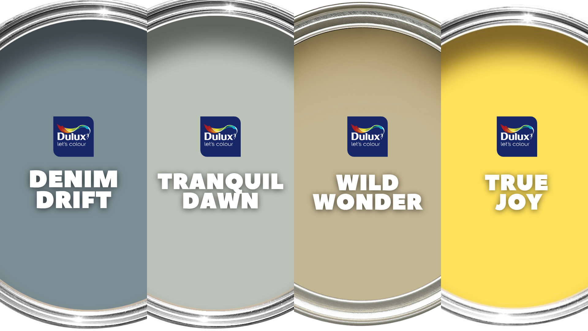
2023: Wild Wonder - a golden neutral inspired by the natural world, bringing a sense of energy and positivity.
2025: True Joy - a bright, uplifting shade reflecting optimism, celebration and emotional connection.
Dulux describes the process as a shift away from rigid colour trend cycles towards something more fluid: allowing us to choose the "tempo", or mood, of our spaces.
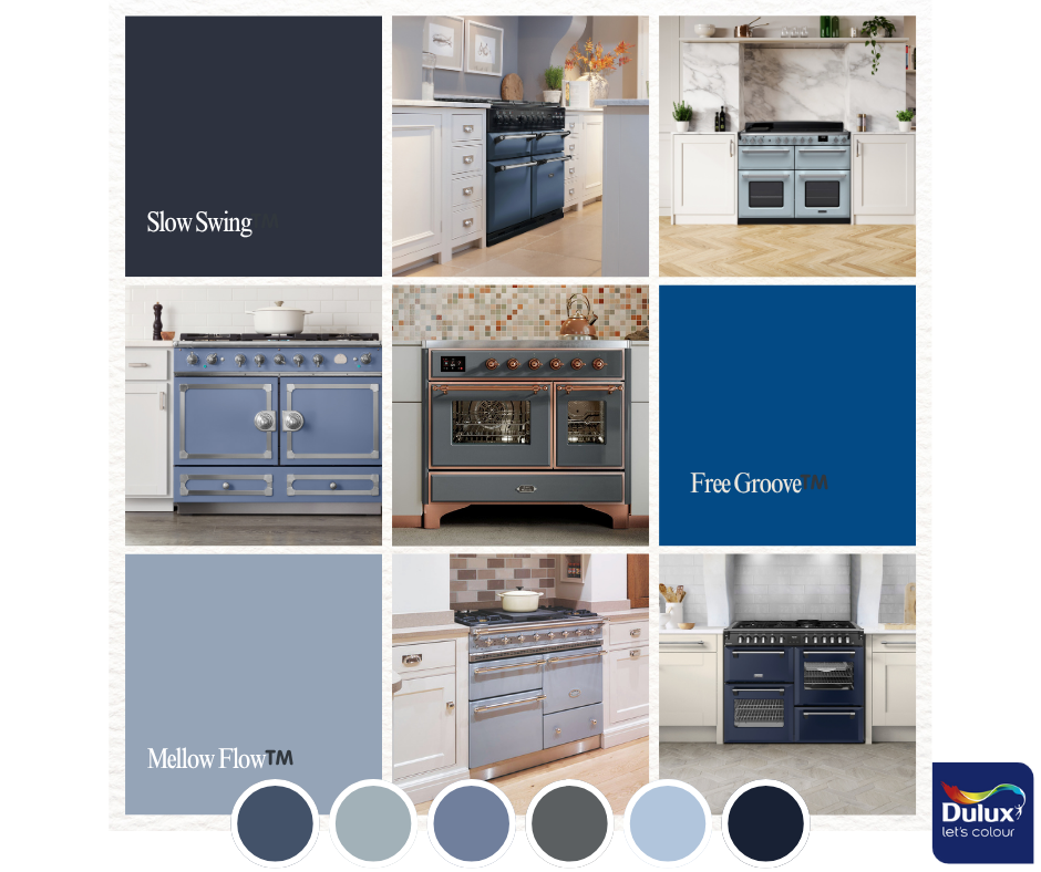
The Three Blues
Let's look more closely at each shade, and how you might use them...
Mellow Flow™️
Light, calming, open, breathable. Think seaside sky, soft horizons.
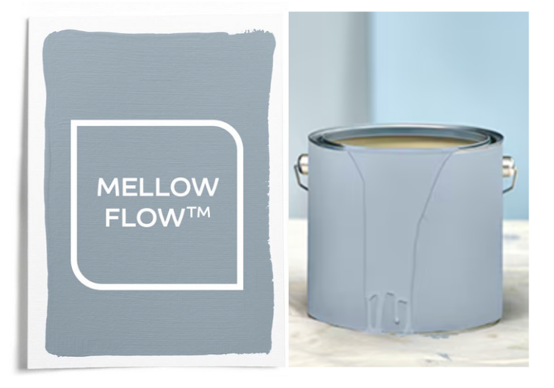
Use it in: Bedrooms, living rooms, or any space you want to feel relaxing and airy.
Pair it with: Warm neutrals, sandy beiges, muted terracotta's - giving contrast without competing.
Slow Swing™️
Deep and solid. It feels moody but soothing in its intensity.
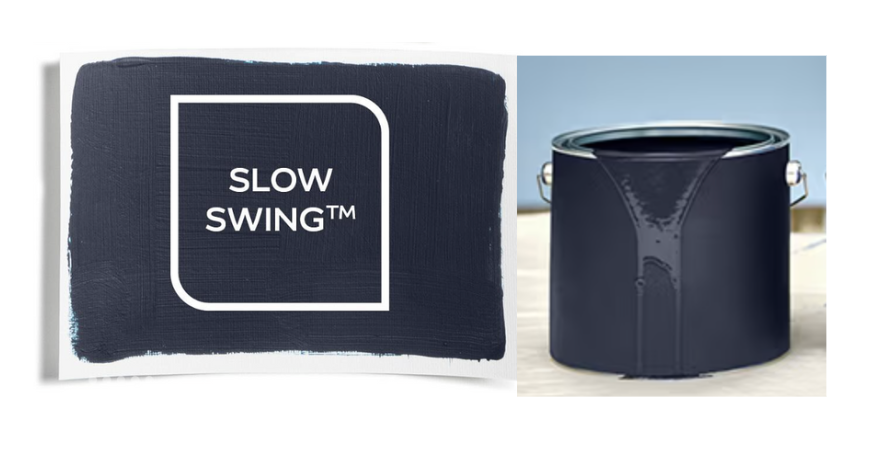
Use it in: Snugs, feature walls, home offices - spaces where you want some drama without losing comfort.
Pair it with: creamy off-whites, warm woods, brushed metals.
Free Groove™️
Bold, expressive, upbeat. It feels playful and confident - a colour that wants to show itself.
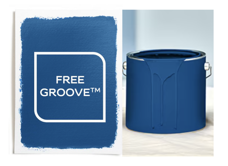
Use it in: accent walls, kitchens, hallways, or wherever you want a pop of energy.
Pair it with: bright yellows, crisp whites, even muted pinks for contrast.
Blue, of course, has long held a special place in interior design - it's timeless, versatile and emotionally resonant. What about a blue range cooker, you ask? This would work perfectly when it is intentional, tying it in with other small accents like bar stools or small appliances, so it looks like part of a cohesive colour story rather than a lone statement.
Let's take a look at some of the blue range cookers we have available...
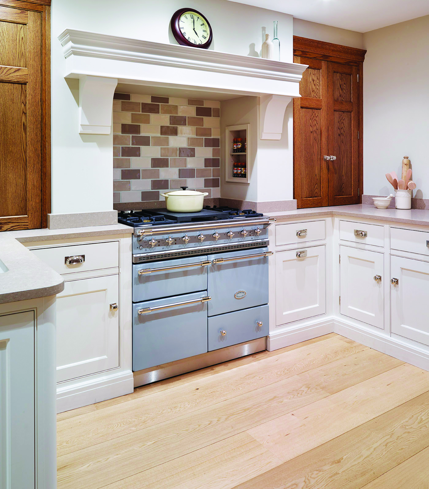
AGA Masterchef - Dartmouth Blue
Dartmouth Blue is a rich shade, reminiscent of the sea, that works in both traditional and contemporary kitchens. The name comes from the English coastal town Dartmouth, evoking the point where sea meets the sky. It is intended to sit somewhere between the softer pale blues and darker navy blues - neither pastel nor extremely deep.
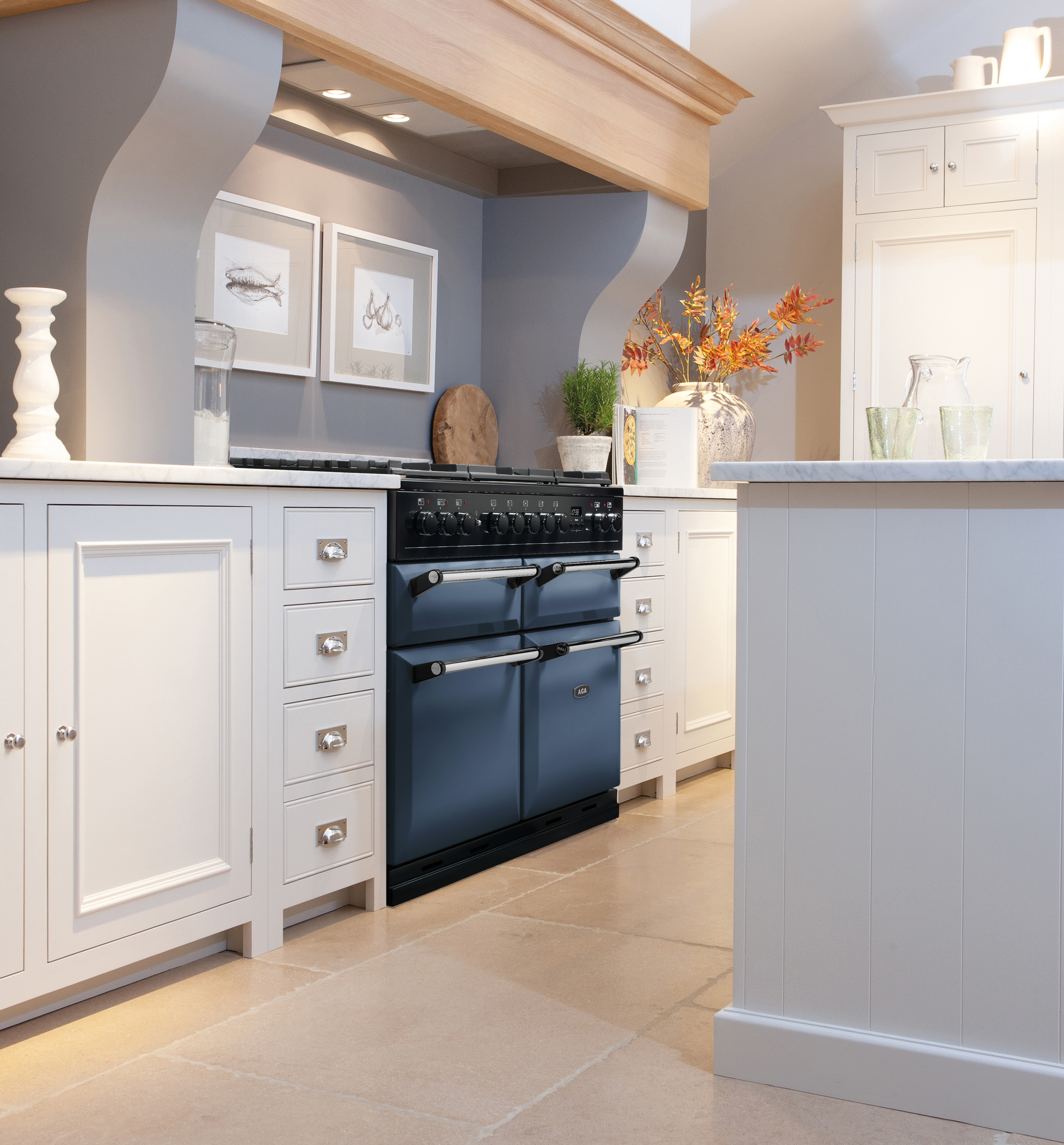
This colour pairs nicely with natural wood tones, with warm woods bringing a contrast and cooler woods, such as white oak, bringing a sense of harmony.
Rangemaster Estel - Misty Blue
Misty Blue is one of Rangemaster's newest colours, introduced as part of the launch of the Estel models.
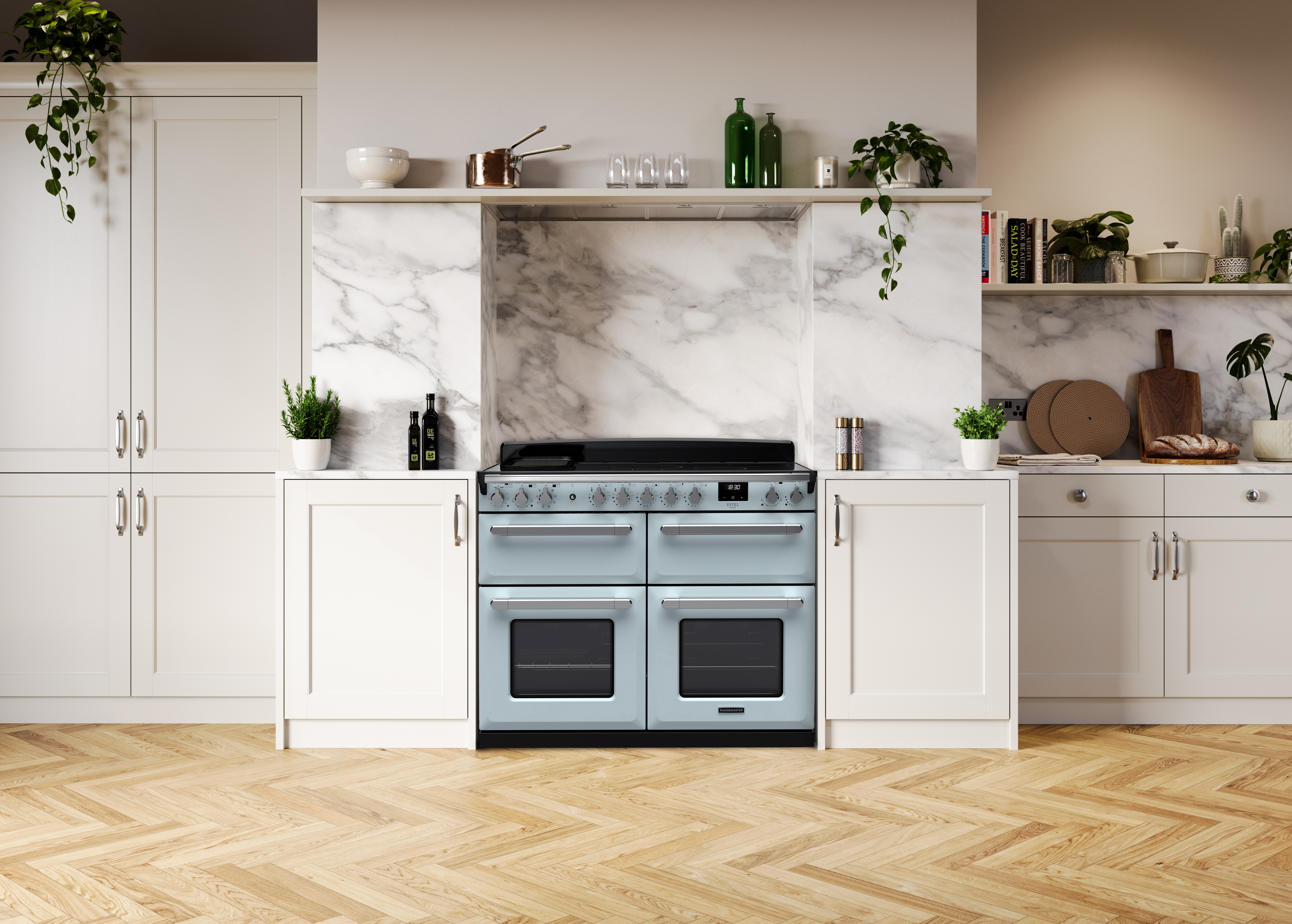
This soft and hazy shade brings a sense of tranquility, with its muted quality offering a soothing essence. Pastels and soft colours have cylindrical popularity, bringing a more human, comforting touch in contrast to colder/more industrial styles. Misty Blue fits into this wave, with it not being perfectly neutral but still fitting into even the more muted kitchens.
Blue Grey began as an optional extra with ILVE's bespoke RAL colour match service, but became so popular it is now a standard colour. It is a more muted blue with grey undertones, with the grey taming the intensity of the blue to make it more elegant and understated.
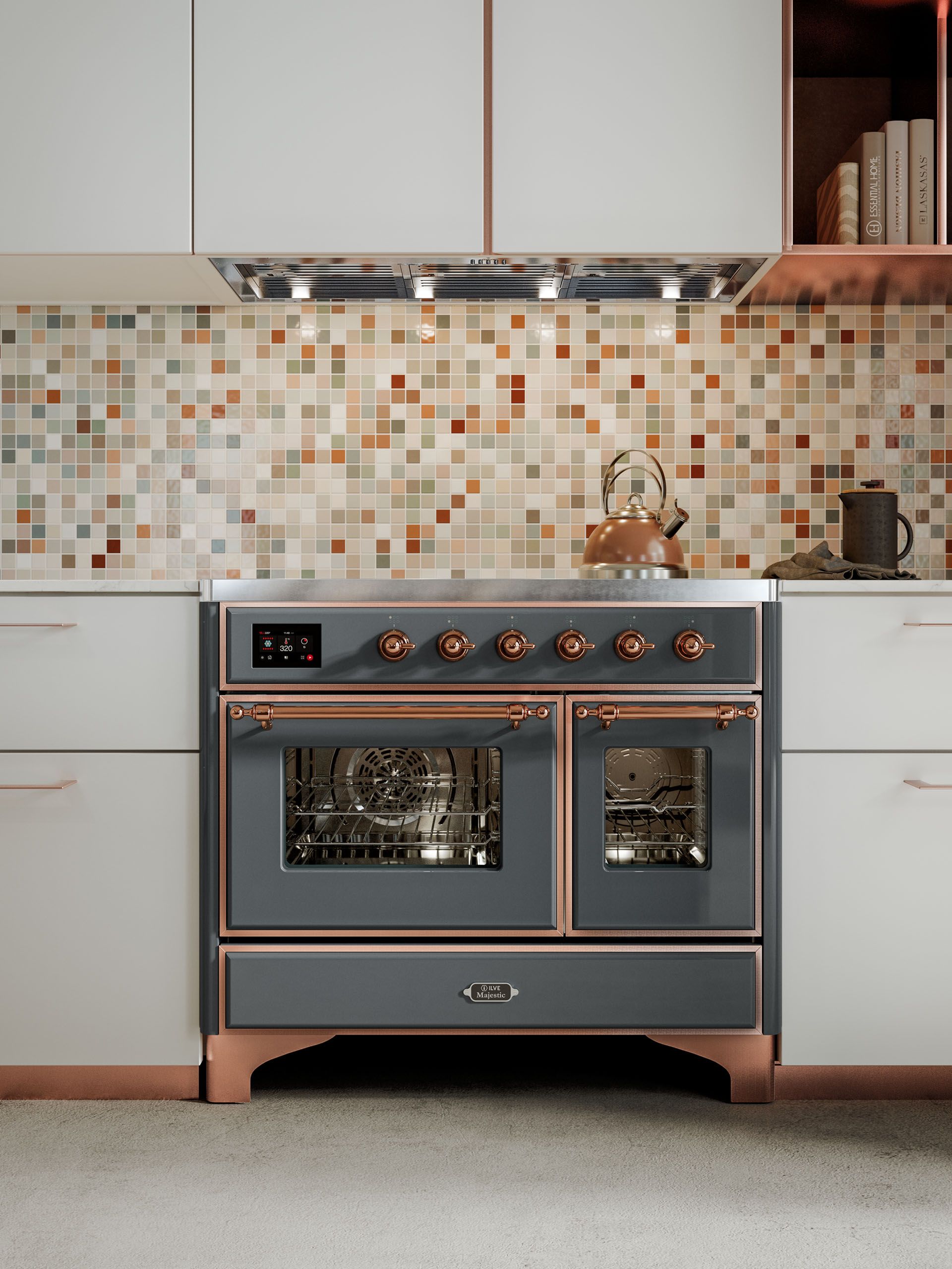
As it is not too warm, not too cold, it can work with a range of cabinetry styles, such as light woods, painted finishes and neutrals, plus different metal finishes - which is perfect with ILVE offering the choice of a Brass, Copper or Antique Bronze trim alongside their standard Chrome.
La Cornue CornuFé - Provence Blue
Provence Blue is one of the classic colour finishes offered in La Cornue's CornuFé line. A soft, medium blue with warmth, this finish isn't a pastel baby blue, but also nowhere near a navy. There is a richness so that it isn't overly bold, with a kind of timeless gentility.
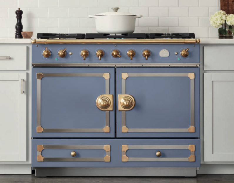
When paired with warm metals such as a polished brass or brushed nickel, this colour leans slightly more towards a warmer blue. Under bright natural light, the blue will appear more saturated with cool undertones visible.
Stoves Richmond - Midnight Blue
Midnight Blue is part of Stoves' Colour Boutique range, a thoughtfully curated palette of six exquisite shades that are inspired by the natural world. Whilst it could be mistaken for black in dim lighting, a closer look reveals the blue undertone that sets Midnight Blue apart.
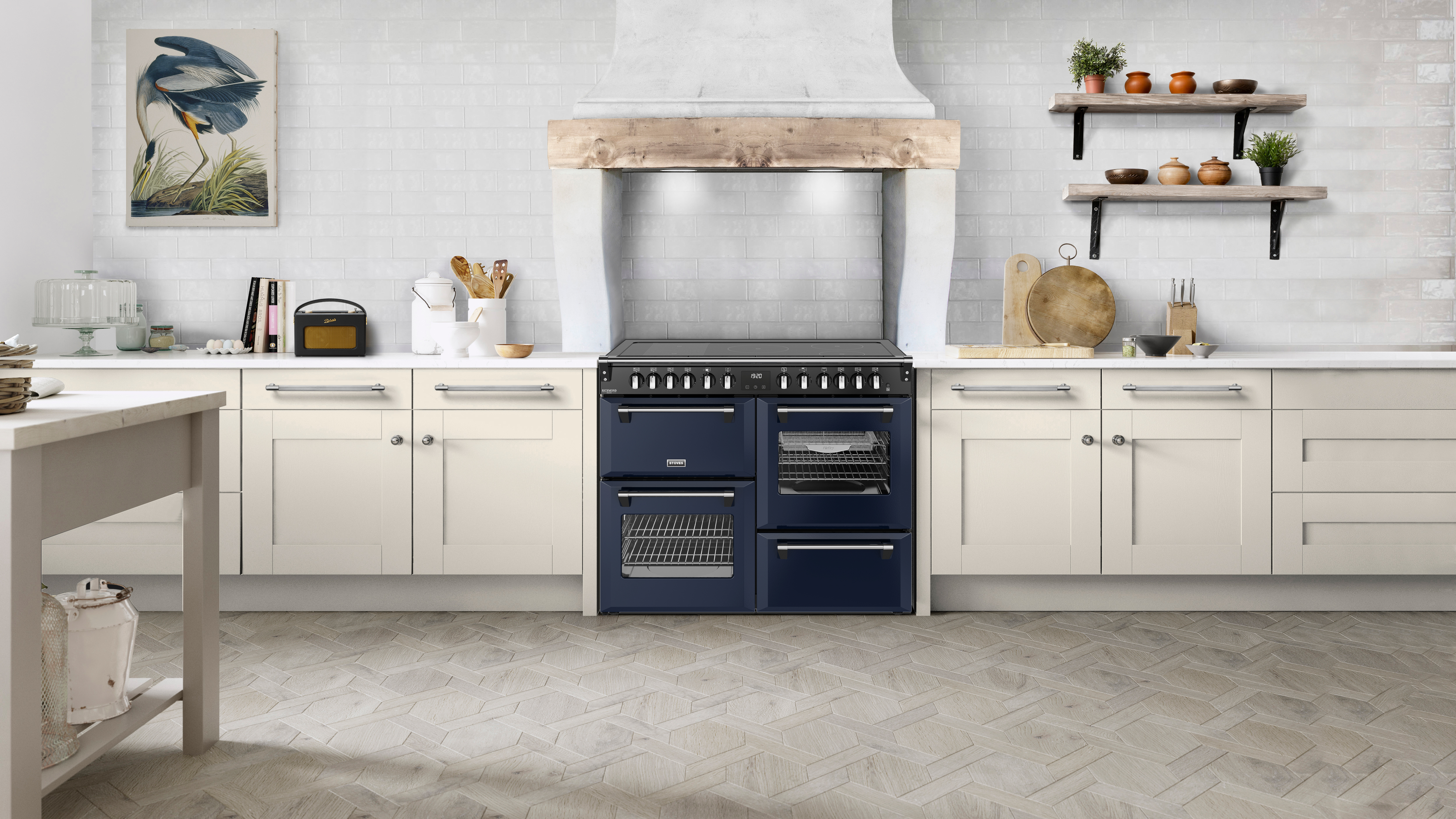
It is a colour that symbolises elegance and sophistication: think of the classic midnight blue tuxedo - a timeless alternative to black that is favoured for its unique but polished look.
A soft to medium blue, with a gentleness that puts it between classic vivid blues and muted greys. It carries connotations of porcelain or Delftware (the Dutch tin-glazed pottery).
The enamel finish gives Delft Blue a sheen and depth, and in bright light the enamel's gloss will make the blue appear more vibrant. In softer or diffused light, it will look more tempered, possibly with a slight shift towards greyish-blue depending on surroundings.
The vibrancy of a blue range cooker adds personality and charm, making every meal feel just a little more special. Check out all the blue cookers, and many more colours, available on our website here.