How to make a bright coloured range cooker the star of your kitchen
Many kitchens lean towards a neutral when it comes to appliances - think sleek stainless steel, timeless white, or classic black. But a bright coloured range cooker? That's the design equivalent of wearing a show-stopping dress to a party.
It is bold, expressive, and instantly transforms a functional space into a place with personality. If you're considering making a statement, the key is knowing how to choose the right shade and style so it elevates your kitchen rather than overwhelms it.
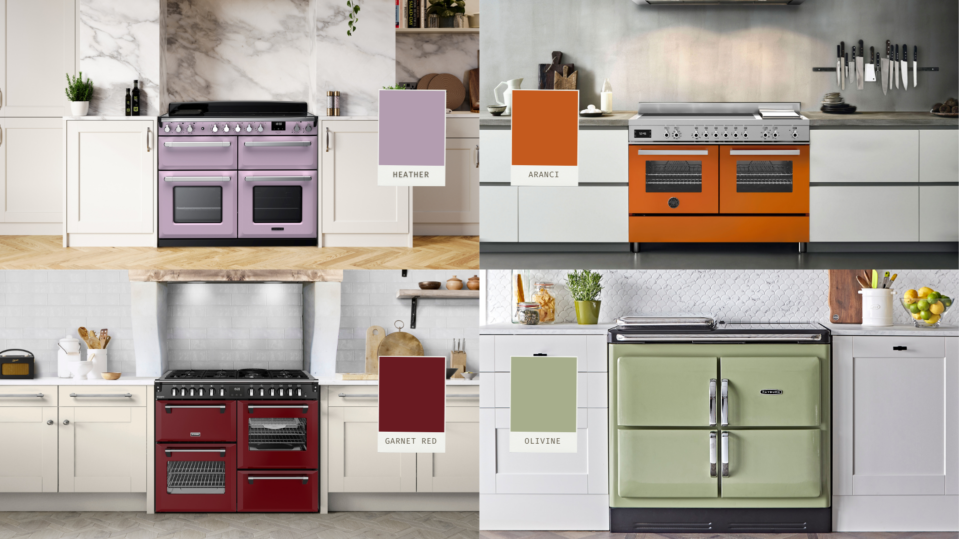
1. Pick the right colour for your personality and space
A bright range cooker can be anything from a sunny yellow to a deep, luscious teal. Your choice will set the mood for the whole kitchen.
- Red or orange → energetic, warm and inviting
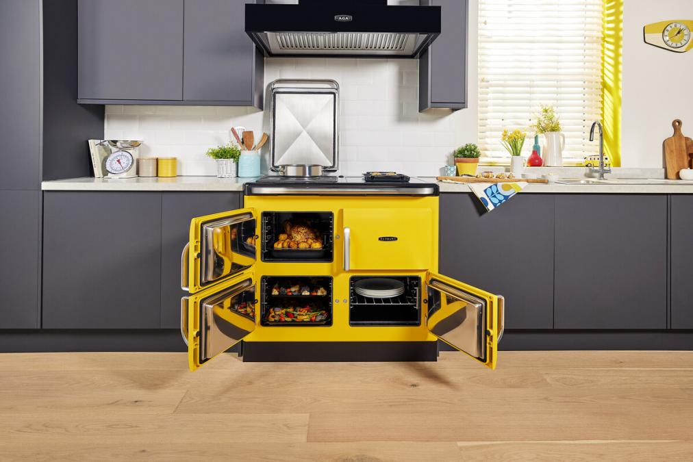
- Yellow → cheerful and uplifting, perfect for a light-filled space
- Green → fresh and grounding, works well with natural wood accents
- Blue → calming yet striking, a timeless choice
- Pink → warmth, charm and a hint of the unexpected
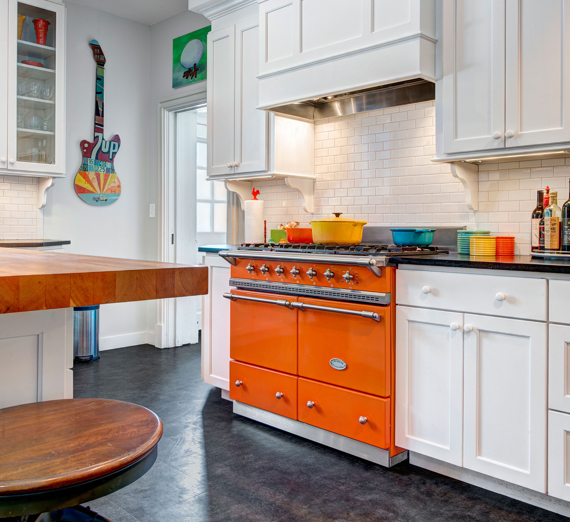
A bright red range cooker brings an undeniable sense of energy - it is perfect for sociable kitchens where friends gather around with a glass of wine. A rich orange or burnt tangerine has a similar inviting quality, but with a slightly retro feel that pairs beautifully with mid-century cabinetry.
If you're wanting something uplifting and cheerful, a sunny yellow can brighten even the cloudiest morning, especially in a light-filled kitchen. For a more grounded and natural vibe, greens are wonderfully versatile: a soft sage works well in country kitchens with wooden beams, while a deep emerald can add sophistication in a modern setting. Blue and teal shades offer the best of both worlds - they're striking enough to stand out, but are still calm and timeless and make them easier to live with long term. And then there's pink, from a soft blush that feels romantic and airy to a bold fuchsia that bursts with playful personality, pink can bring warmth, charm and a hint of the unexpected to a kitchen.
2. Keep the surroundings of your cooker balanced
A bright cooker works best when the rest of the kitchen complements rather than competes with it. Think of it as your "leading actor" with the cabinets, walls and worktops as the supporting cast.
A cobalt blue cooker against bright red cabinets is a fast track to visual chaos (and a headache). Soft, neutral cabinetry - white, cream or pale grey - allows the cooker to sing without competition. Walls and additional items such as splashbacks should also complement rather than clash, a simple white tile or a pale marble effect slab keeps the focus exactly where you want it to be.
Worktops also play an important role. A simple quartz or marble-effect counter with subtle veining is often the best choice, as it adds texture without clashing with the vibrancy of your range.
3. Add small accents in matching or constrasting colours
Having a bright colour doesn't mean it needs to live in isolation. Echoing it somewhere else in small, deliberate touches creates a sense of cohesion. A cherry-red kettle on the counter to match a red range cooker, a pair of pink bar stools to tie in with a pink cooker, or even a piece of wall art that picks up the same tones - all of these make the bold choice of your cooker feel intentional.
For the daring, you could even introduce a contrasting colour that sits opposite on the colour wheel: a mustard kettle with a navy cooker, or burnt orange mugs with a sage green range, can make the whole kitchen feel artfully styled. The trick to making a bright range look intentional rather than random is repetition.
- Matching tea towels, utensil holders or bar stools
- Artwork or plants to soften the effect and keep it from feeling too stark
4. Use lighting to enhance the colour
Lighting is another factor that can dramatically change how your cooker looks. Warm-toned bulbs tend to make reds richer and yellows cosier, whilst cool white lighting can give blues and greens a crisp, modern edge. If you want to treat your cooker like the centrepiece it is, consider installing a spotlight or under-cabinet lighting (often available on a cooker hood) that frames it like a work of art.
Natural light is also part of the equation. If your cooker sits near a window, think about how the sunlight changes throughout the day. A yellow range might look slightly darker and muted in morning light but comes alive as the afternoon sun hits. If your kitchen doesn't get much natural light, clever use of mirrors or glossy finishes in your cabinets and splashback can help bounce light around the room, keeping the colour vibrant instead of shadowed.
5. And what about the more practical side?
As exciting as it is to pick out a cooker in bright pink or sunshine yellow, practicality still matters. Style is important but so is usability:
- Make sure your cooker's finish is easy to clean - glossy finishes can be more forgiving than matte for wiping down fingerprints and splashes.
- Choose a brand with a strong reputation for build quality. A bright range is an investment, and you'll want the colour and the mechanics to stand the test of time.
- Bold colours can exaggerate the presence of an appliance - make sure the cooker's proportions suit your kitchen layout so it dominates in style, not in scale.
- If you're a passionate baker or cook daily for a family, practicality might outweigh looks. Consider if you need dual fuel or induction, then pick your dream colour in that configuration.
What colours do you offer at Rangecookers.co.uk?
Good question, we have many colour options to choose from - plus a bespoke RAL colour service that allows you to choose a shade we may not have.
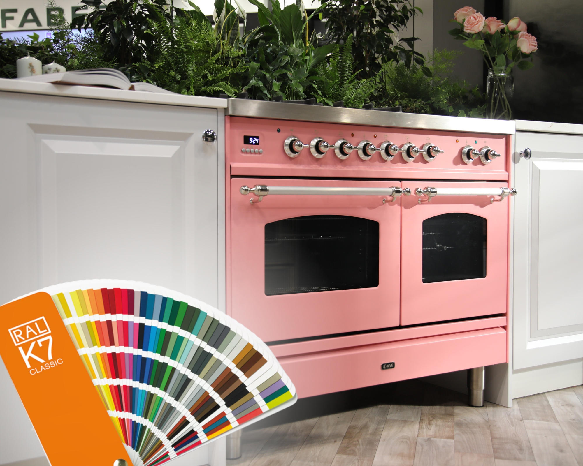
Both ILVE and Lacanche offer a bespoke colour match service, using RAL classic colours for hundreds of different range cooker possibilities. Developed in 1927, RAL has since been standardising and numbering colours into a named and numbered system. With this are some truly beautiful colours if you are looking for that something special for your home that you cannot find within the standard colours offered.
Pink
This pale pink tone on the Estel Deluxe falls in a gentle pastel - a delicate blush that exudes charm and warmth without overwhelming the space. It is soft and subtle, almost muted, whilst still offering a distinctly playful and nostalgic appeal.
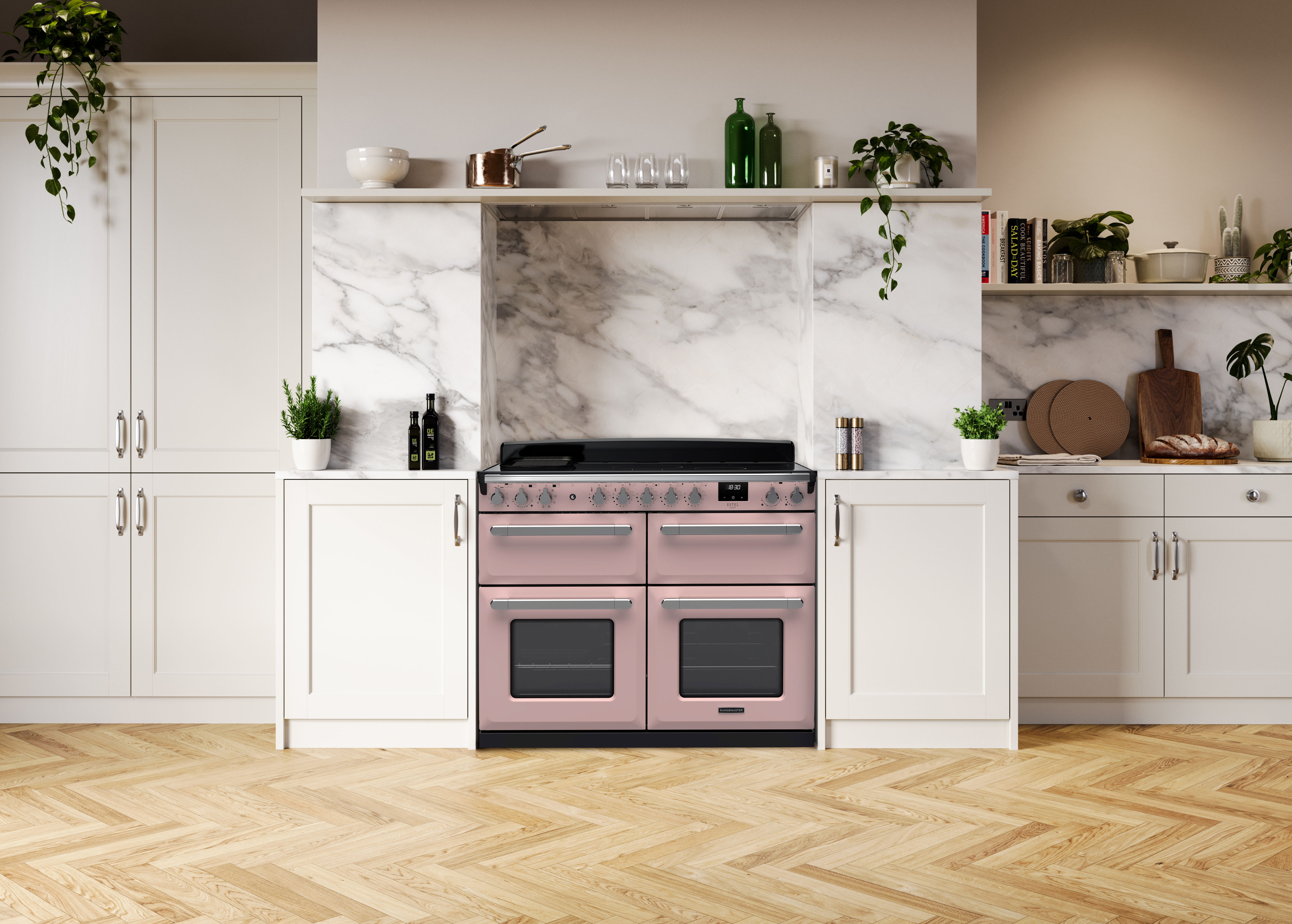
The pairing of this shade with the polished chrome trim provides a modern, refined feel. It offers a tasteful pop that would be perfect in a cottage-style or classic shaker kitchen.
One Reddit user even wrote "The Estel looks almost like a toy oven to me, so much so it feels like a crime not to get it in a pastel."
Red
Rich, bold and undeniably striking, this Garnet Red shade from the Stoves' Colour Boutique range is a colour that brings confidence and elegance. Named after the gemstone, it lies between deep crimson and ruby as a deep, dark red with undertones of brown or purple that give it a luxurious and earthy warmth.
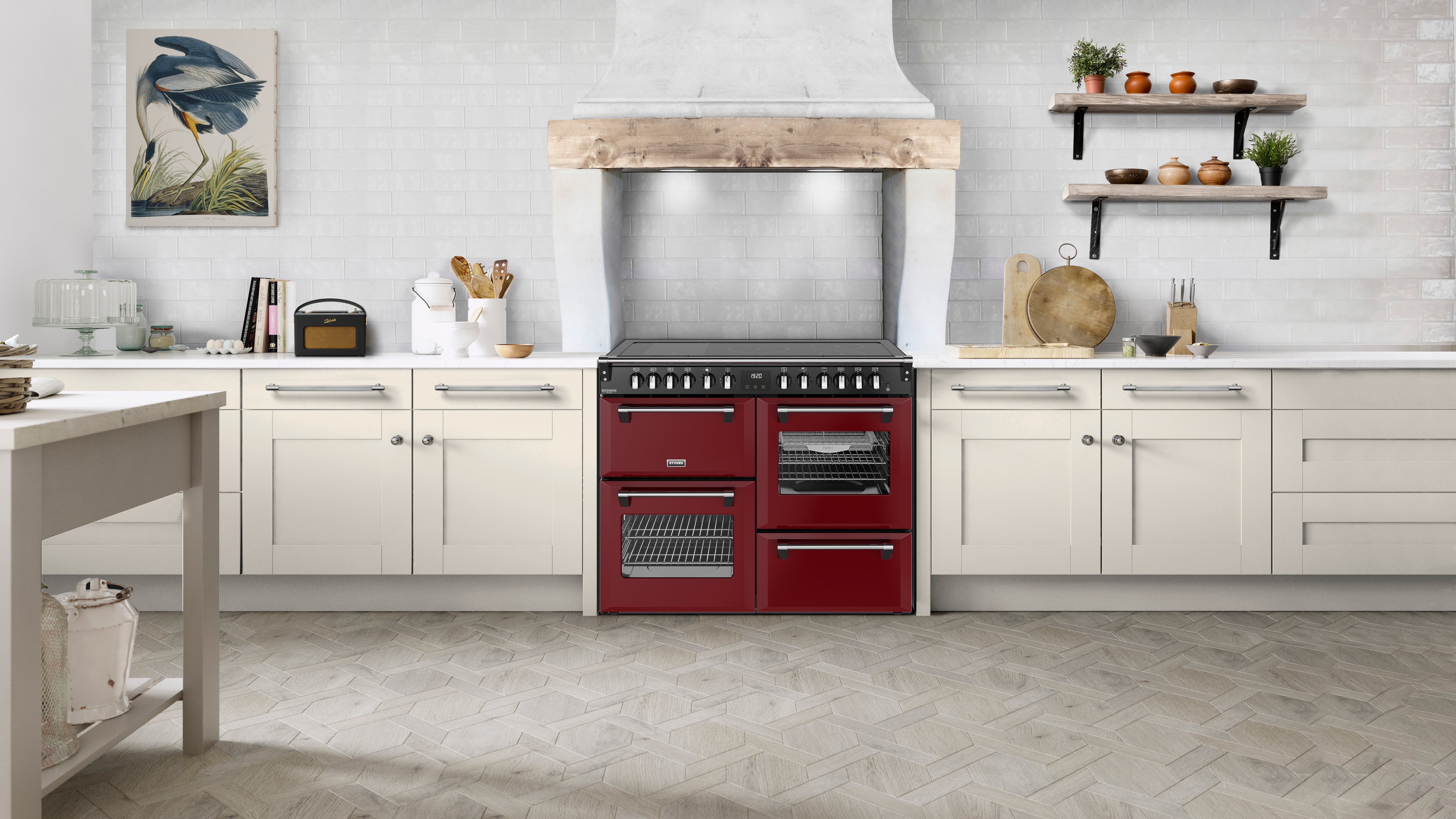
The stone, and the colour, symbolise strength and vitality. Unlike bright or cherry reds, Garnet Red is more muted, refined and versatile, bringing a dramatic feel but not aggressive.
This shade pairs perfectly with materials such as grey quartz worktops, brushed gold accents and light oak cabinets.
Yellow
Lacanche's Provençal Yellow is a luminous, buttery yellow - reminiscent of sunlit lavender fields and aged stone façades of southern France. This shade has a vintage Mediterranean feel, classic yet unexpectedly vibrant. Like all Lacanche finishes, it is hand applied and heated at a very high temperature for rich, lasting depth and brilliance.
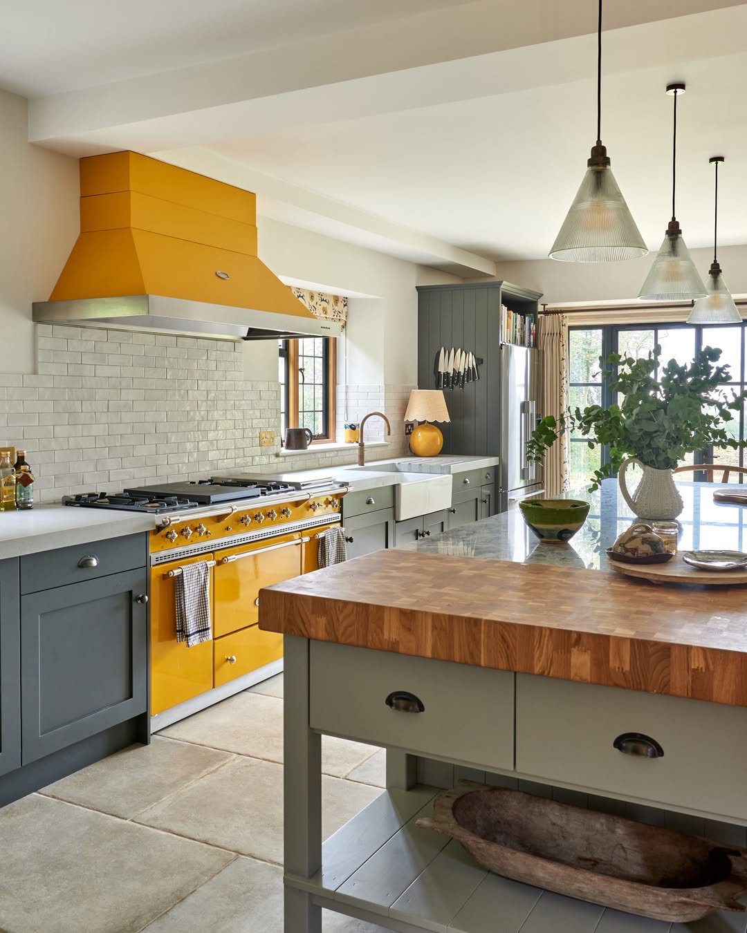
Credit: @mikegarlickdesign & @johnstonparkeinteriors
This shade demands attention whilst still retaining a cosy, inviting kind of charm. One of the most distinctive features of this colour is how it shifts throughout the day depending on the natural light. In this kitchen featured, with large, windowed doors at the end, the colour comes alive as the sunlight enhances its golden warmth, making the whole room feel lighter and more cheerful - almost like a permanent summer glow.
Green
The Emerald Green finish from ILVE is a deep, jewel-toned hue that brings elegance and a touch of drama. It radiates sophistication whilst maintaining a cosy, timeless character.
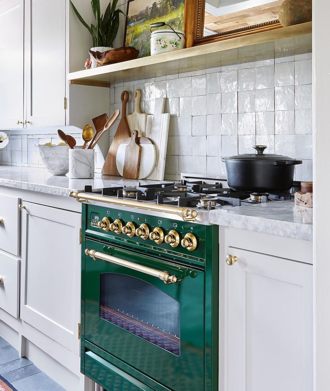
When paired with a brass trim, this green takes on a new layer of refinement. The warm metallic of brass highlights the rich green, adding a glowing contrast that feels both classic and luxurious. This combination is perfect for elevating traditional or eclectic kitchens - imagine deep green hues softened and made more inviting by the golden sheen of brass accents.
Blue
China Blue from Falcon is a soft, sophisticated pastel - imagine a gentle, greyed out powder blue that balances elegance with warmth. Its subtle, but strong enough to serve as a statement, yet muted enough to remain timeless.
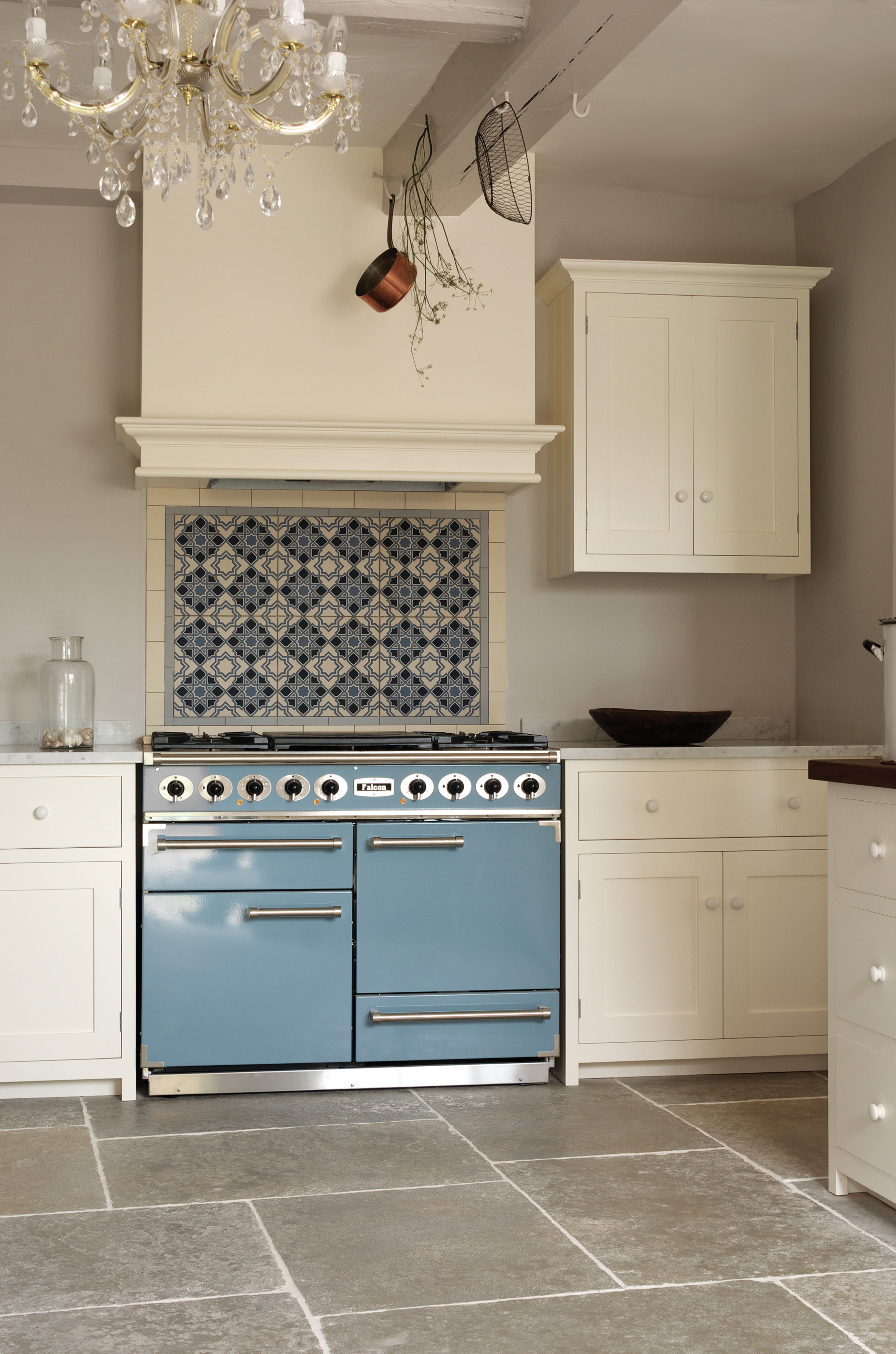
Blue has long been associated with calmness, clarity and trust. Unlike bolder navies or darker indigos, which can have their own place within the kitchen, this soft pastel carries an airy, uplifting quality - evoking clear skies and a sense of serenity.
We have so many more colours available at Rangecookers.co.uk, so why not take a look for yourself. If you have any questions, please give our team a call on 01244 402 975.