Creamy Beiges, Mushroom Taupes & the New Neutrals
For several years, neutral kitchen design was dominated by crisp white, cool grey, sharp stainless and black accents. These colours created clean, contemporary spaces, but the latest kitchen palettes are moving in a noticeably softer direction.
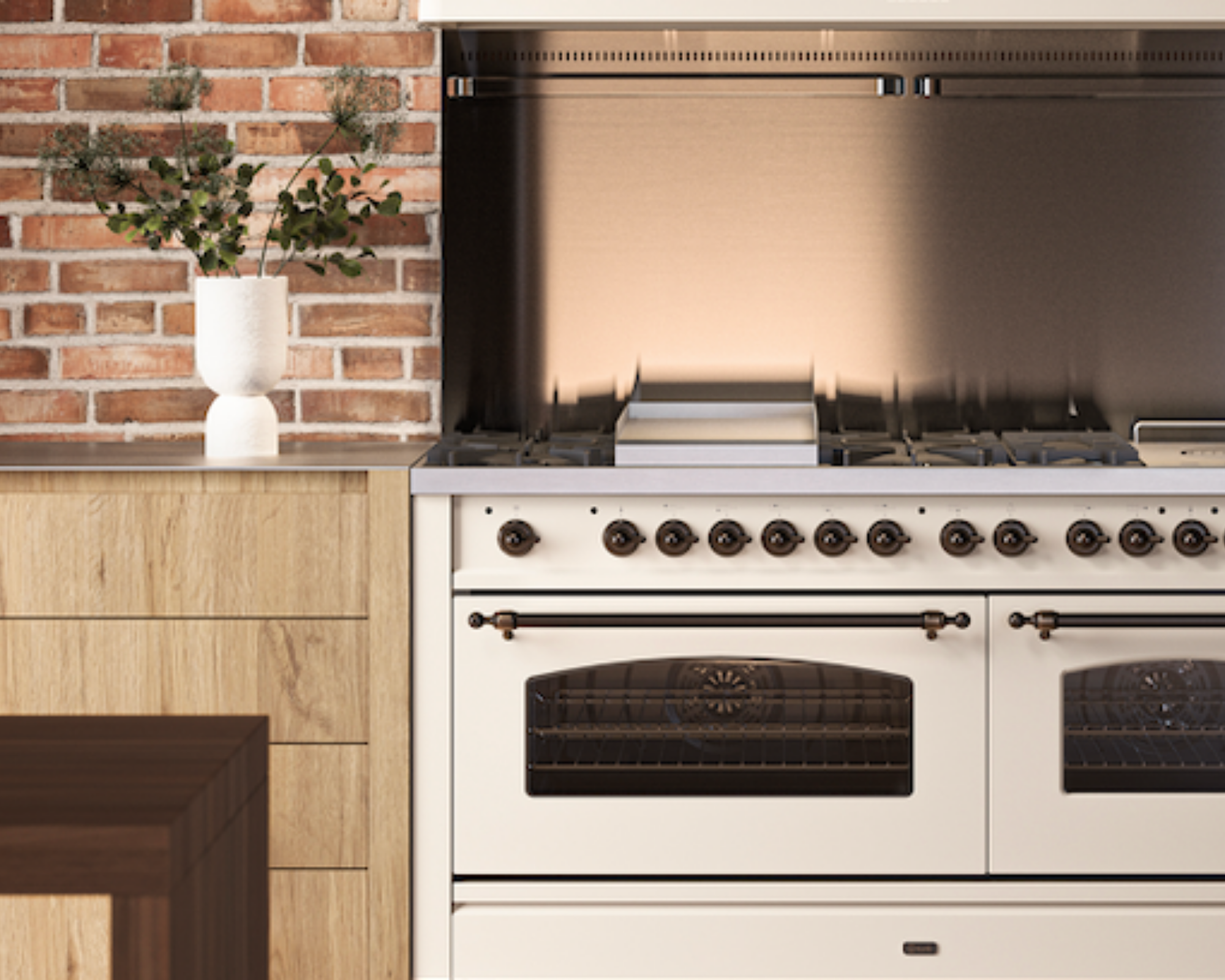
Creamy beige, mushroom taupe, oatmeal, putty, warm stone - all of these shades are becoming some of the most influential kitchen colours of the year. They retain the calm and versatility that make neutral kitchens so appealing, but introduce warmth, depth and character.
This direction can also be seen in the colours selected by some of the world's leading colour authorities. Pantone chose Cloud Dancer, an airy white, as its Colour of the Year for 2026, while Sherwin-Williams selected Universal Khaki, a warm mid-tone neutral with a subtle yellow undertone. Together, they reflect a wider shift away from colder shades and towards colours that feel more natural and comfortable within the home.
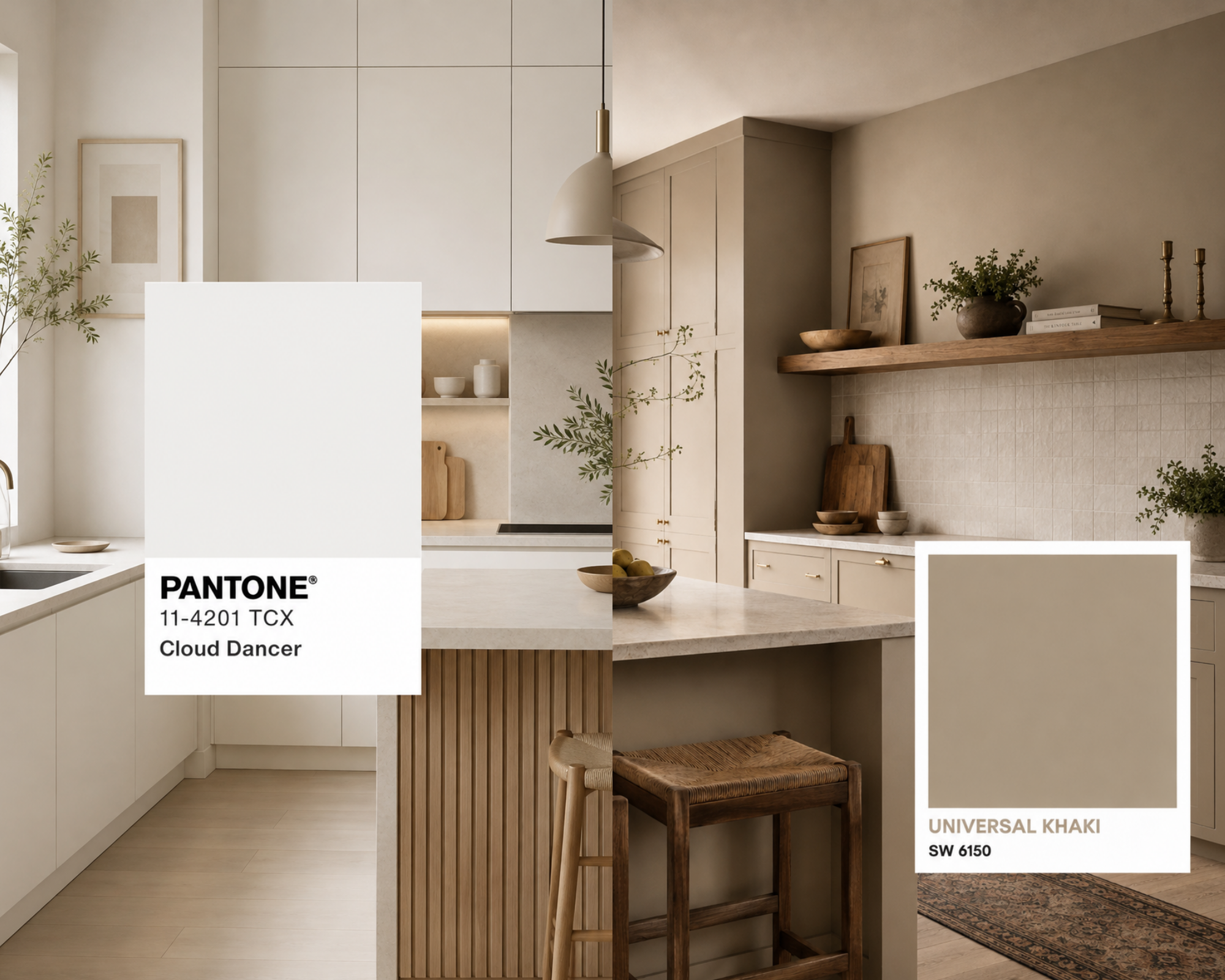
For the kitchen, these warmer neutrals offer an ideal foundation. They work well across cabinetry, walls and larger appliances, helping the room feel considered without appealing overly coordinated.
Why Warm Neutrals are Replacing Cool Grey
Grey kitchens are not necessarily disappearing, but the way grey is being used is changing. Blue-based and silver greys can sometimes feel cold, particularly in kitchens that receive limited natural light. Mushroom and taupe shades soften this effect by introducing brown, cream or clay undertones.
The result is a colour that still feels natural but has considerably more depth.
A mushroom-painted cabinet can look grey in cooler morning light, before becoming warmer and earthier as the light changes throughout the day. Creamy beige has a similar quality. It can brighten a room in much the same way as white, while avoiding the stark contrast that can occur between bright cabinetry, stone surfaces and larger appliances.
Creating Depth Without Adding Bold Colour
A neutral kitchen does not need to rely on one shade across every surface. In fact, the most successful schemes often combine several closely related tones.
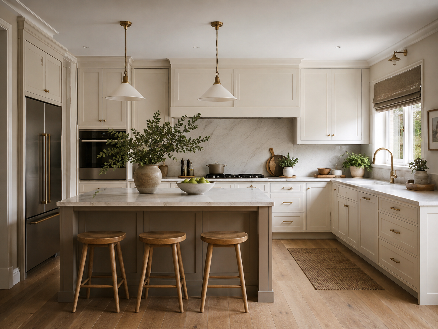
Cream cabinetry could be paired with a slightly deeper taupe island, while a pale stone worktop introduces another subtle variation. A mushroom-coloured wall can then provide definition without creating a dramatic contrast.
Texture becomes particularly important with this type of scheme. Timber cabinetry, lightly veined stone, handmade tiles and brushed metal handles prevent warm neutrals from appearing flat. The colours remain calm, but the differences in surface and finish give the kitchen its character.
This tonal approach also allows larger appliances to become part of the design. Rather than placing a bright white or stainless-steel cooker into a carefully layered neutral kitchen, a cream, ivory or custom-coloured range cooker can continue the palette and create a more integrated appearance.
Choosing the Right Undertone
Although beige and taupe are often treated as simple neutrals, their undertones can change how they behave within a kitchen.
Some creamy beiges have a yellow or golden base, making them a natural partner for oak, walnut and antique brass. Mushroom shades often contain more grey or brown, giving them a slightly earthier appearance that works well with limestone, concrete-effect surfaces and darker timber.
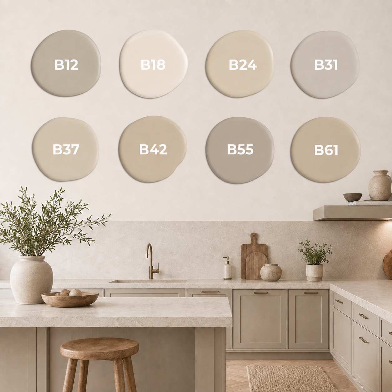
Taupes can vary even more. A warm taupe may lean towards cocoa or clay, while a cooler interpretation can sit closer to greige. Before committing to a colour, it is worth viewing samples beside the actual worktop, cabinetry and flooring, rather than considering each element separately.
The range cooker finish should be included in this process. A cream cooker may appear noticeably warmer beside a grey-based cabinet, while an ivory finish could look almost white against deeper mushroom units. Neither combination is incorrect, but seeing the materials together will help determine whether the difference feels deliberate.
Making the Range Cooker Part of the Palette
A range cooker occupies a significant amount of visual space, which means its colour can influence the balance of the entire kitchen.
In a warm neutral scheme, the cooker does not always need to stand apart from the cabinetry. Choosing a related enamel colour can create a softer, built-in appearance while still allowing the appliance's handles, controls and doors to provide architectural contrasting detail.
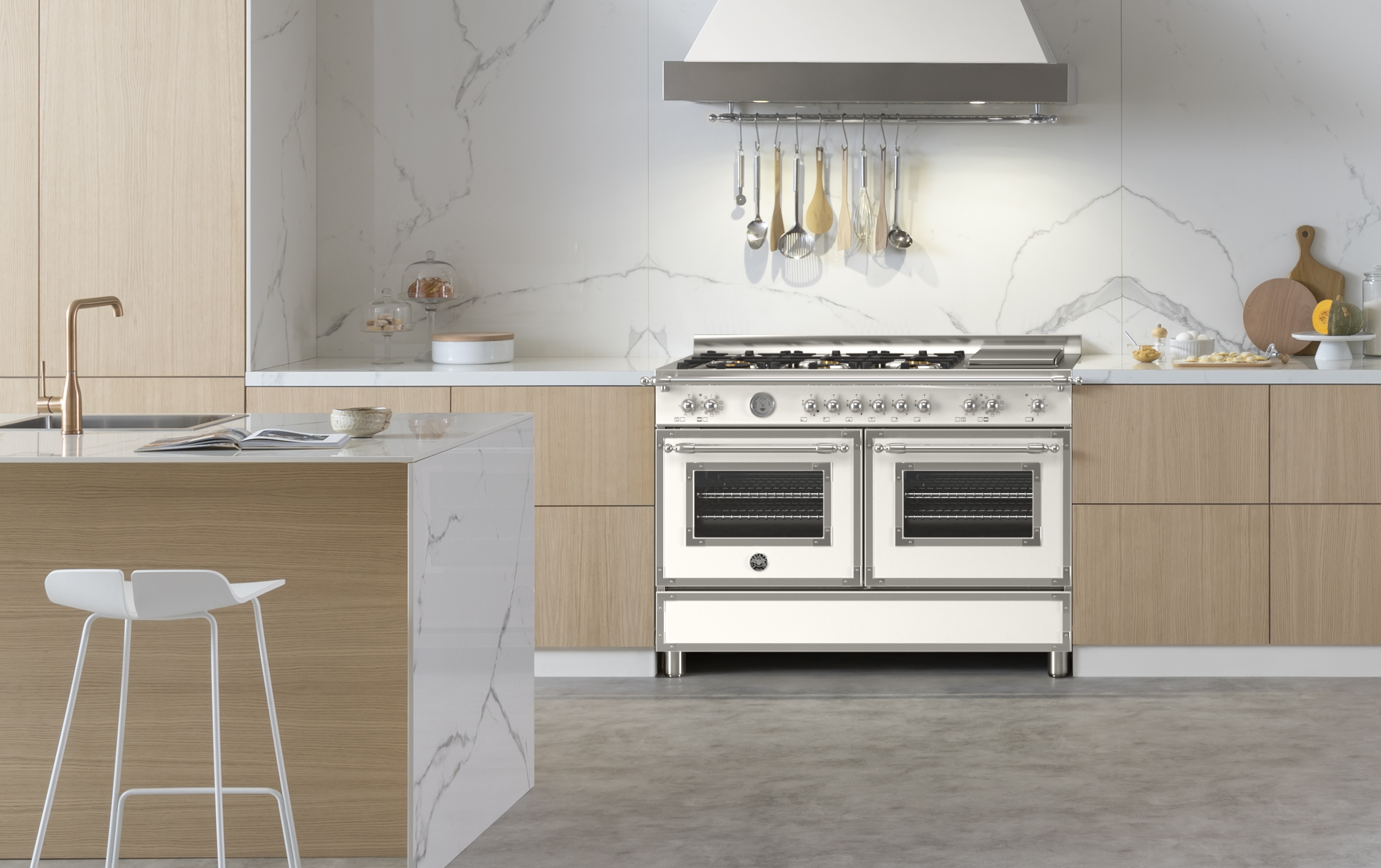
The Bertazzoni Heritage collection in Avorio is a good example. Avorio has more warmth than a conventional white finish, allowing it to sit naturally beside cream cabinetry, pale timber, and lightly coloured stone.
The Heritage design is particularly well suited to kitchens inspired by classic European design. Its elegant proportions and traditional detailing give it a sense of permanence, while the overall finish remains clean enough to work in a modern setting.
Rangemaster's Pale Cream finish offers another way to bring this look into the kitchen. Available on models such as the Classic Deluxe, it can be paired with chrome for a fresher finish or antique brass to emphasise the warmth of the surrounding cabinetry.
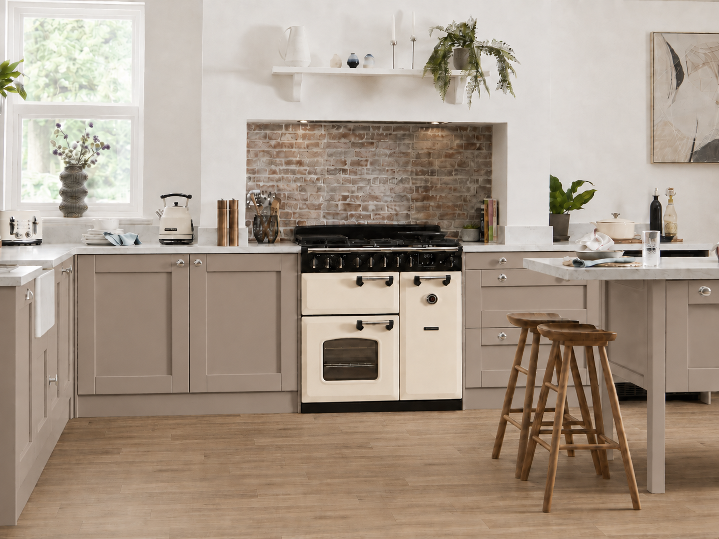
In Pale Cream, the cooker complements the gentle warmth of beige, oatmeal and taupe cabinetry. The colour is light enough to keep the kitchen feeling open, but it avoids the cooler appearance of standard white. With its combination of familiar Rangemaster practicality and decorative appeal, the Classic Deluxe can become a natural focal point without overpowering a subtle colour scheme.
For a more individual interpretation, ILVE offers both Antique White and a custom colour service. Antique White creates a gentle alternative to brilliant white, while the custom service allows an ILVE range cooker to be matched to a chosen RAL colour. This makes it possible to select a precise mushroom, putty or taupe shade that works with your kitchen design or contrasts with it by only a few tones.
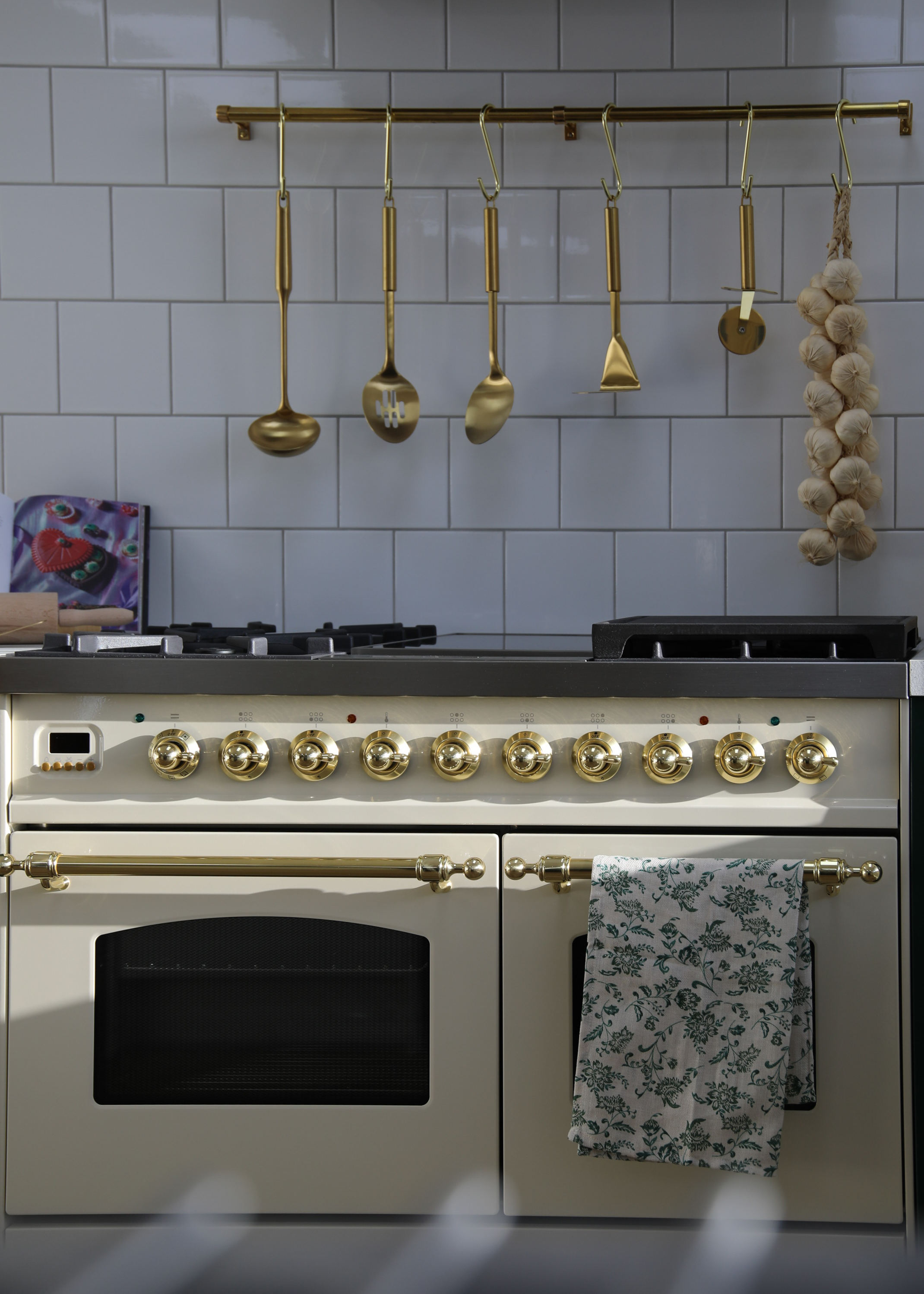
ILVE range cookers offer considerable freedom for homeowners who want to create a more personalised kitchen. Their Italian styling combines professional cooking features with a wide variety of colours and trim options, making it possible to treat the cooker as an integral part of the design.
Lacanche also lends itself particularly well to this style of kitchen. Creamy taupe finishes such as Frangipane can blend into a pale scheme, while the earthier Maron Glacé introduces more depth. These colours work naturally with timber, stone and traditional cabinetry, allowing the cooker to feel established within the room rather than added as an afterthought.
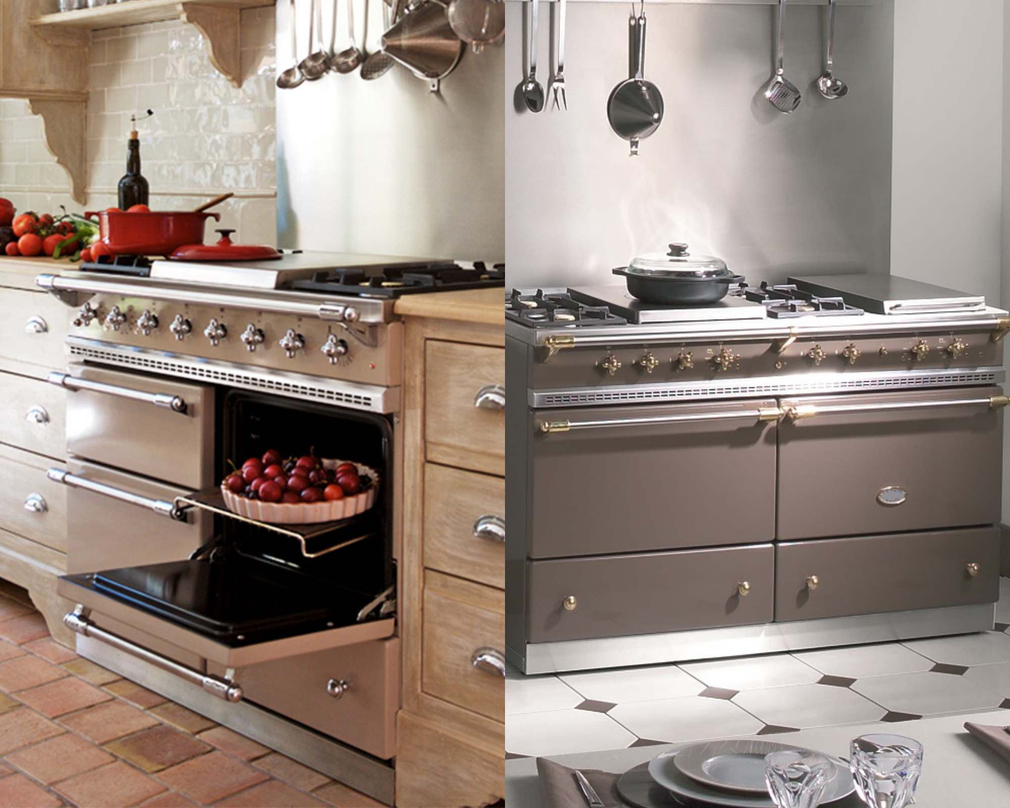
Lacanche range cookers bring a distinctly handcrafted quality to the kitchen. They can therefore work in two ways: it can sit quietly within a pale tonal scheme or act as a deeper, grounding feature at its centre. In either case, its design reinforces the sense that the kitchen has been created to last rather than simply follow a passing trend.
Metals that complement Cream and Taupe
The move towards warmer neutrals has also changed the way metal finishes are being used.
Chrome still provides a clean and familiar contrast, particularly in kitchens where the worktops or splashback have cooler veining. However, antique brass, copper and softer gold finishes can draw out the warmer undertones within cream and taupe.
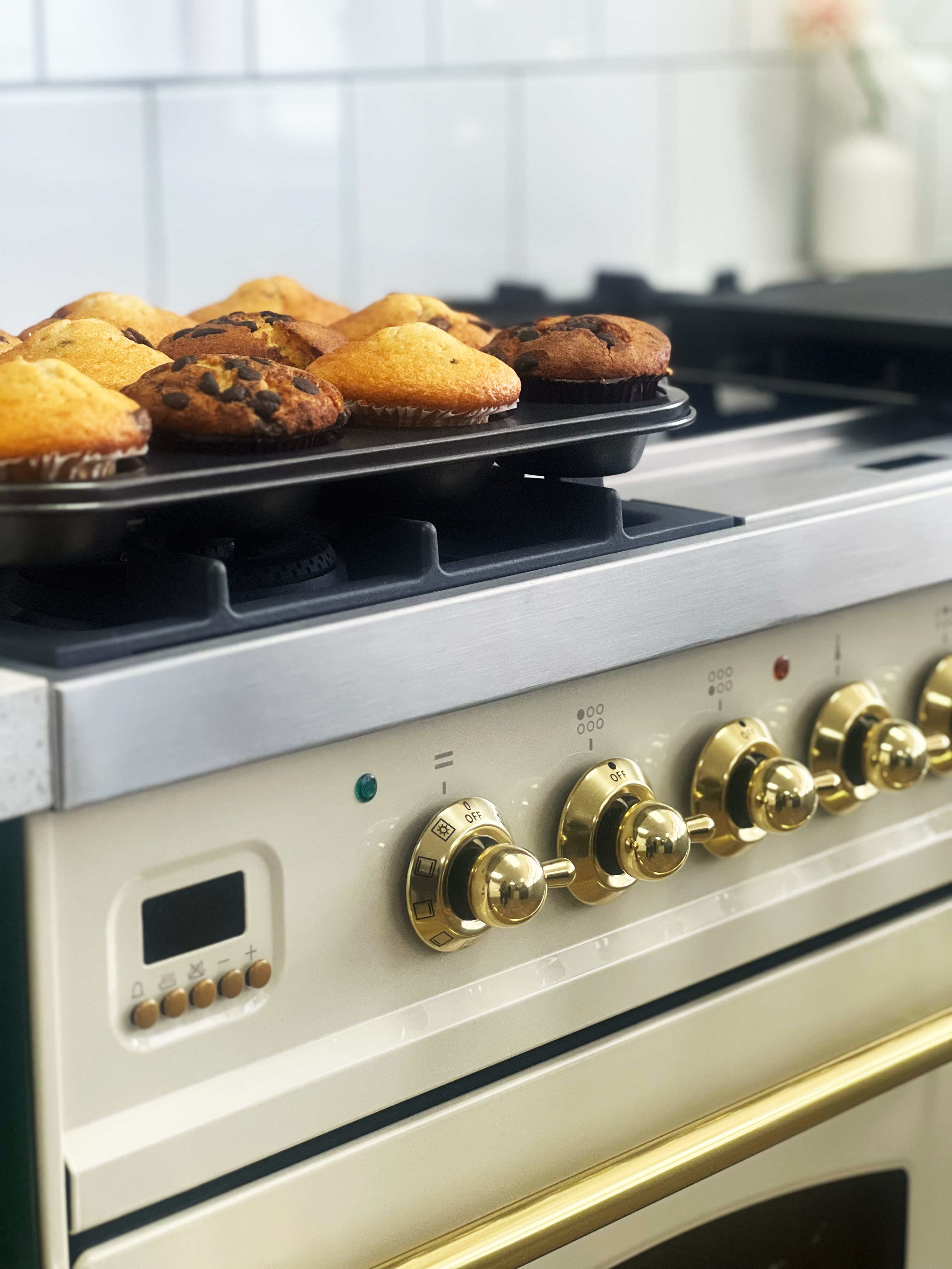
These metals do not need to match perfectly across every detail. A range cooker with brass trim can sit comfortably beside aged-bronze cabinet handles or a brushed-gold tap, provided the finishes share a similar warmth.
Black details can also be effective with beige. Dark handles, window frames, or lighting introduce structure, preventing an entirely beige kitchen from becoming visually indistinct. Used in moderation, they frame the softer colours rather than competing with them.
The appeal of these more neutral shades lies in their ability to adapt. These colours leave space for the kitchen to develop over time. Artwork, cookware, textiles and smaller accessories can introduce stronger colours without requiring the main scheme to change. Explore the collection online or visit our showroom to see how different colours, trims and finishes look together before making your final choice.